OBrien Real Estate
In a competitive real estate market, a strong identity needs to do more than stand out. It needs to build trust, communicate professionalism and create a recognisable presence in the communities it serves.
The Cream Co developed a concept brand identity for OBrien Real Estate, exploring a more contemporary and considered approach to property branding.
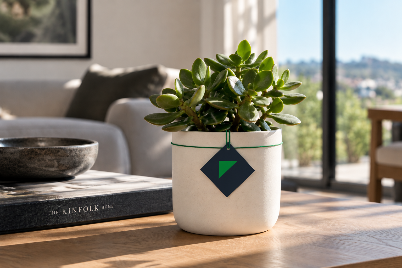
Built around a refined wordmark and a distinctive geometric symbol, the identity combines confident typography, a deep navy palette and a restrained green accent. The result is a clean, flexible visual language that balances the credibility expected of an established real estate business with the warmth and approachability of a neighbourhood agency.
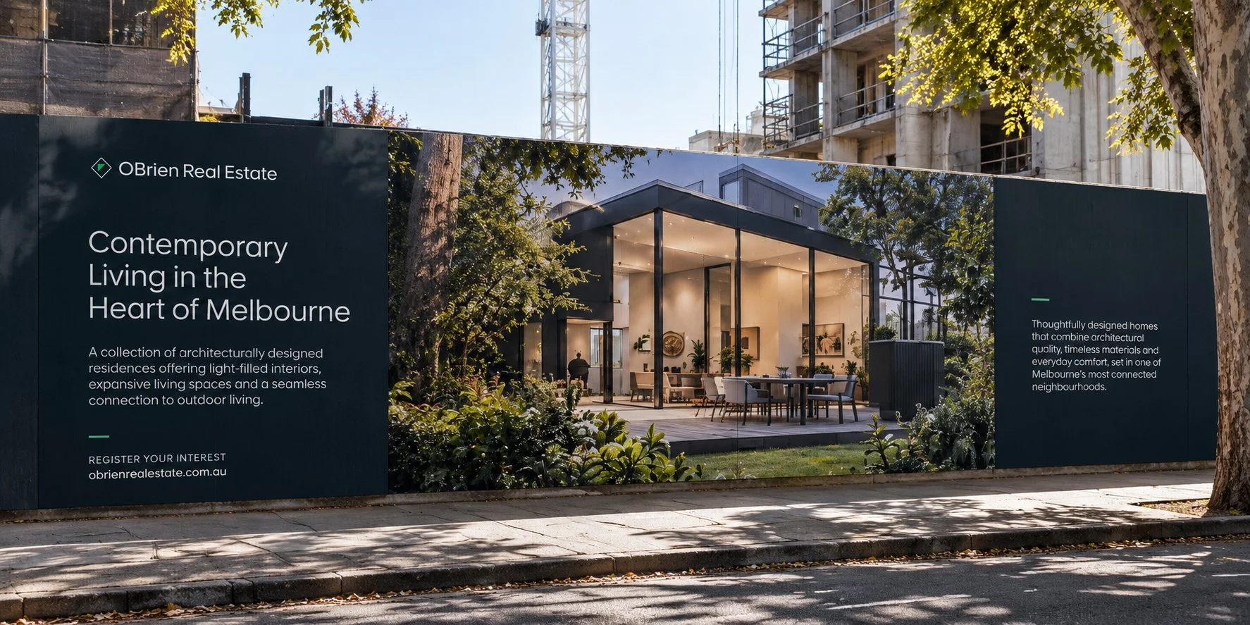
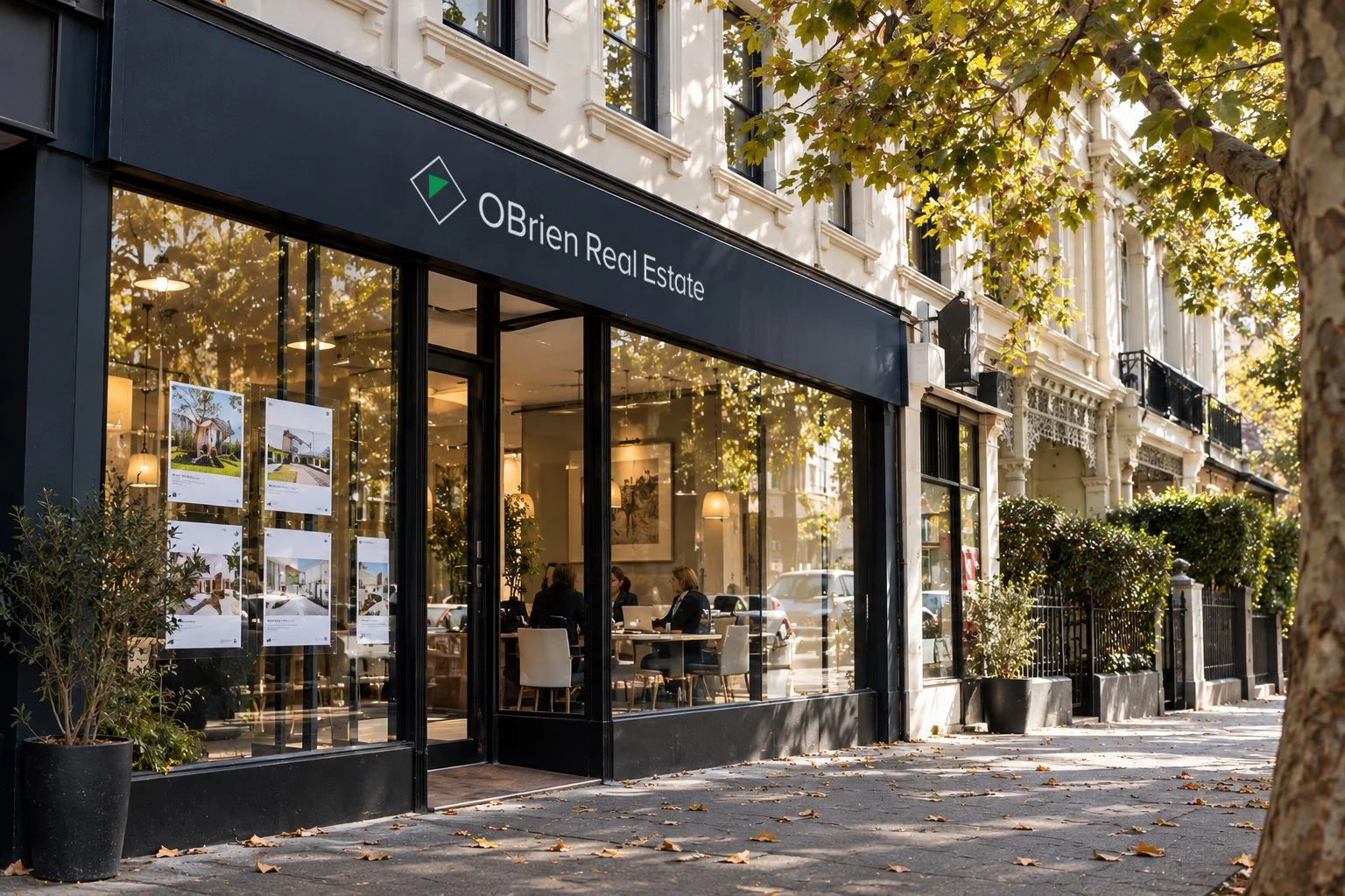
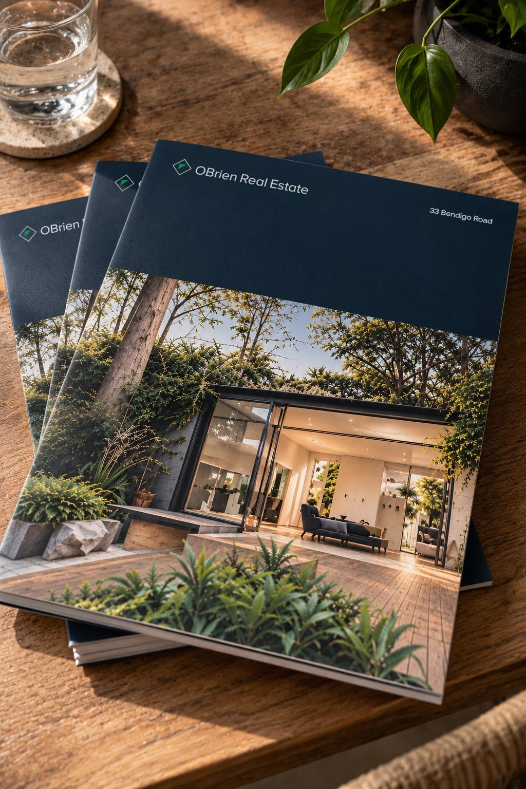
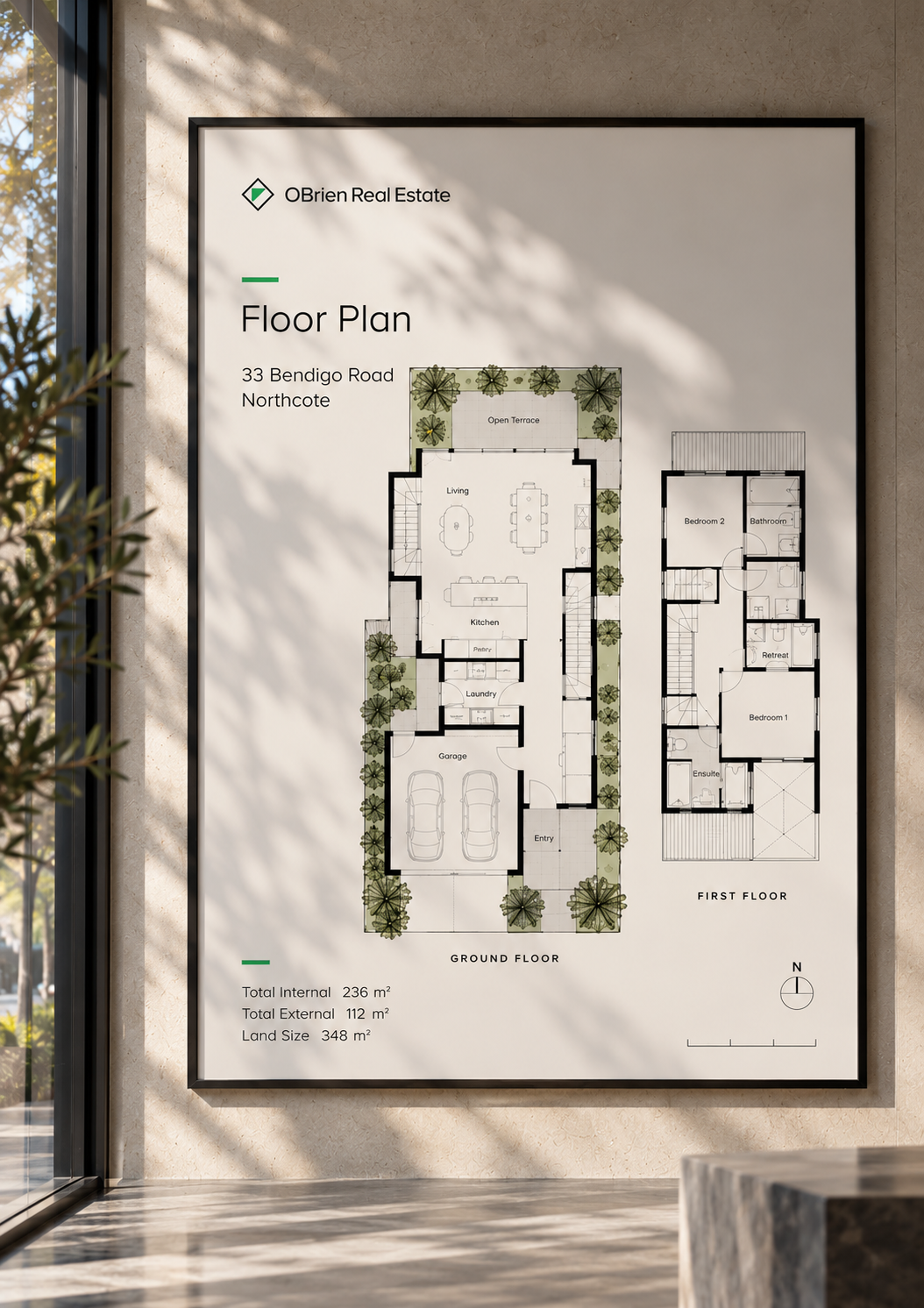
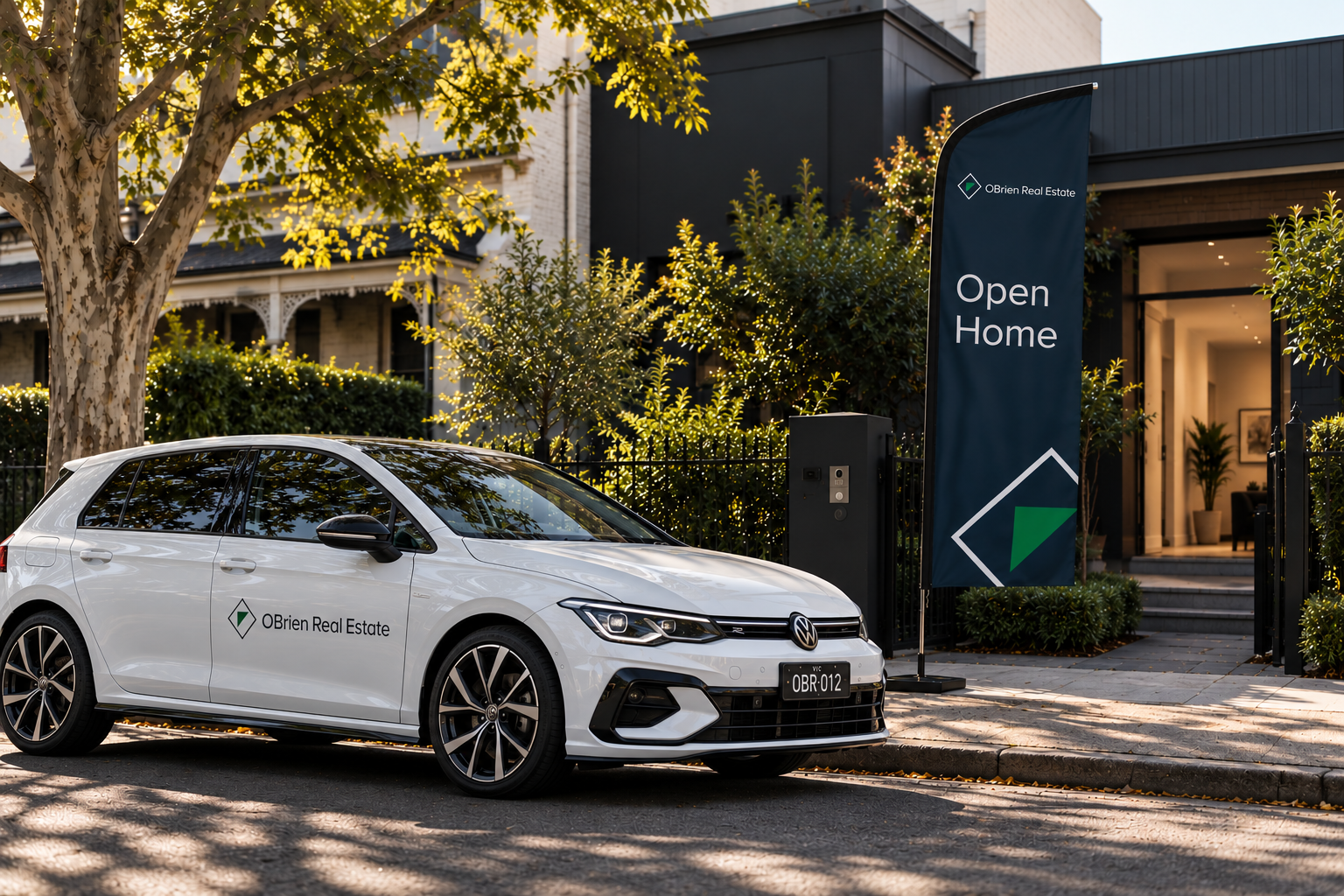
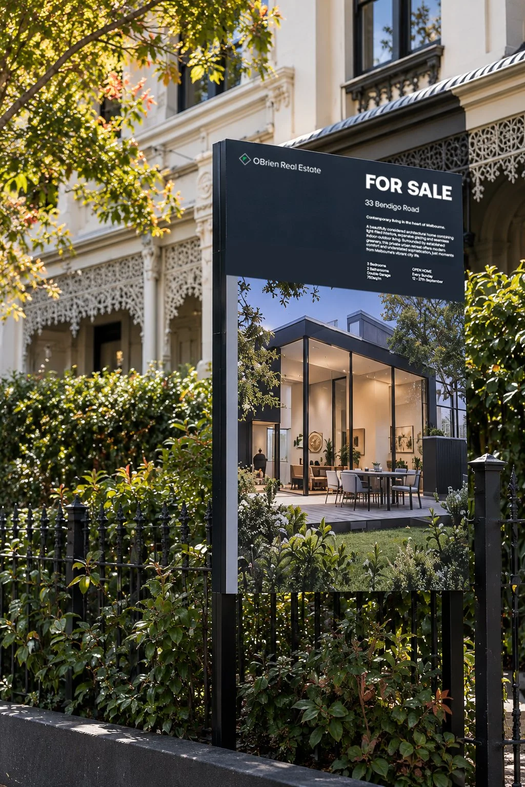
Designed to work across every customer touchpoint, from property signage and marketing collateral to office environments, vehicle livery and digital communications, the system brings consistency and recognition to the brand.
A modern identity with a simple ambition: to make OBrien Real Estate feel established, approachable and unmistakably recognisable.
What we delivered
Identity Design